
Editing Button Blocks
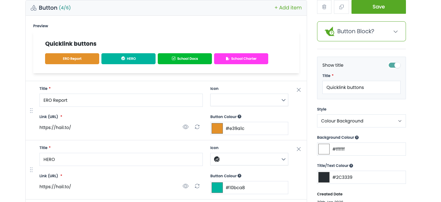
Button style blocks allow you to create up to 6 buttons, each with an icon, title, custom colour and link to either a Hail Article/Publication or an external URL
Buttons are great for providing quick access to important information
How to
- Navigate to the Blocks section of Hail and click + Block.
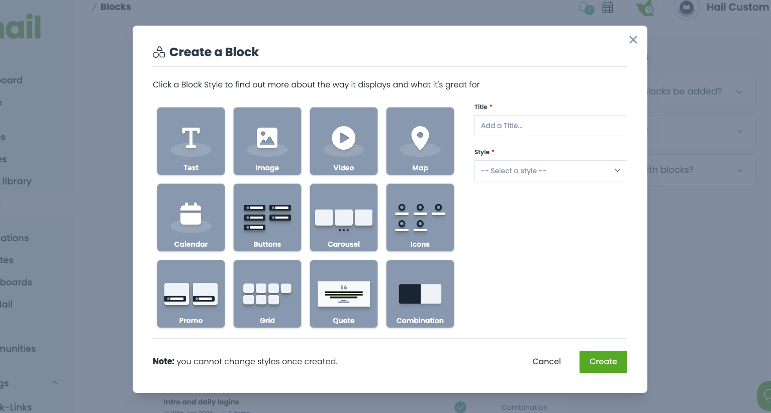
- Select the Button style.
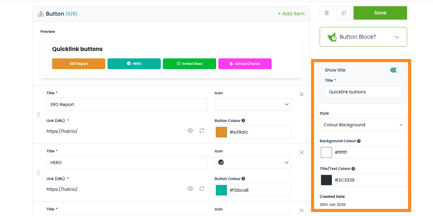
- When you first create a Button Block, your first empty item (button) will be created for you - simply begin to fill it out and any changes you make can be seen in the preview on the right
- First enter a title for the button - avoid making this too long or it will not all be visible within the button!
- Next you may choose an icon from the dropdown to the right - you don't have to use one, but they are a good way to add some extra visual flair
- You can also choose what colour the button will be. Click the 'Colour' field on the bottom left of the button item and a colour picker will appear. You can choose any colour you like - use the slider in the bottom menu to change the base colour, and click anywhere in the gradient above to choose the shade. Make sure the button text is still clearly visible though - this is easy to check using the preview.
-
Finally, select a link for the button. Click 'Add Link' - the bottom right button in the item form - and a modal will pop up, allowing you to select an Article, Publication, or enter your own url.
Note: only published Articles and Publications will show up here - and if adding a custom link, you need to enter the full address, starting with 'https://'
- To add more buttons to your block, click "+ Add Item" at the top or bottom of the list of buttons.
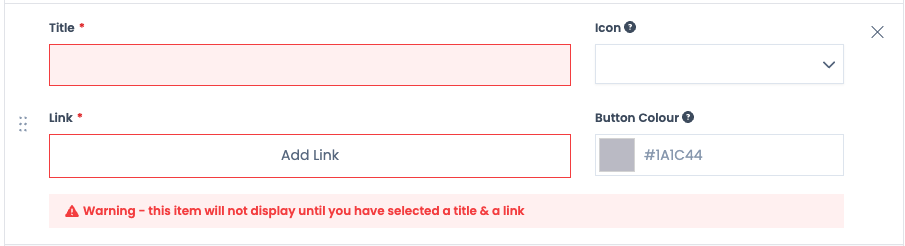
- Some fields in a button must be filled out in order for the button to display on your content. These fields are: Title and Link. If these are not completed, a warning message will display at the bottom of the button in the editor to let you know! Once all required fields are filled out, the message will disappear. Please note that one incomplete button won't stop the rest from displaying - only the incomplete button will be hidden from your viewers.
- Once you have finished editing your buttons, don't forget to hit 'Save' in the top right!
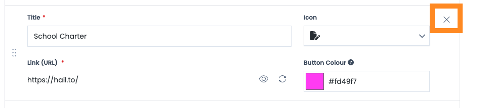
Removing items
-
Button items can be removed from the block by clicking the "X" in the top right of each item. Note - this action cannot be undone!

Changing a Block title and description
- You can also change your Block title in the right hand sidebar if required. This title will display to the public.
-
The Block description can also be edited. Button Blocks do NOT display the description to the public, so this may be used for info or notes if required.

Automatic Text Contrast
When you choose a light background colour for a button, Hail automatically adjusts the text colour to ensure readability. Buttons with lighter backgrounds will display text in a darker colour based on your organisation's palette, rather than white text that would be hard to read.
You don't need to do anything to enable this — it happens automatically based on the brightness of the background colour you select.
Tip: For the best visual result, choose background colours with enough saturation to make the button stand out against your website background.
Actively Being Used
At the very bottom of this page, you can see any locations this Block is in use. This can be handy if you want to make some changes but aren't sure if it will affect any unexpected locations - just scroll down to the bottom and the name and style of any content using this Block will be listed. Any of these items can then be viewed straight away by clicking the "Edit' button in the list.